
Introduction
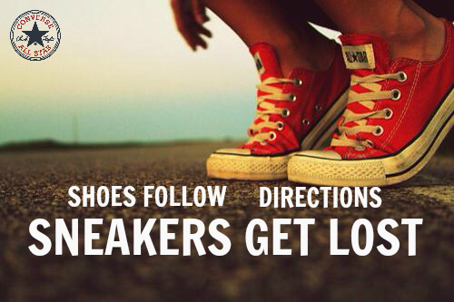
This is a shoe advertisement promoting the popular Converse shoes, sold all throughout the world. These shoes came out in 1917 and became popular with many generations. This specific ad was created by Michelle Suzette Jones who is a UX writer for many websites and went to Skidmore College. This ad is more targeted towards younger people with the outdoor-middle of the road shot.
Link to Original Ad:
Original Ad Analysis
Design
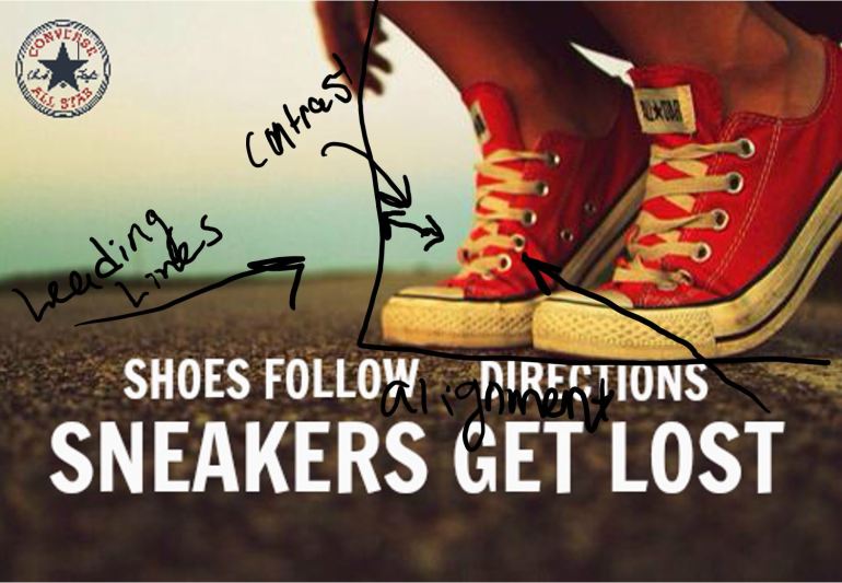
In the design of this Advertisement, they used contrast, Alignment and leading lines. Having the red shoes up against the blue background creates contrast, but more on that in the next section. Everything in this photo has a reason on where it is located. The shoes are aligned to the right with the left side of the photo being opened allowing the leading lines draw the viewers around the back.
Color
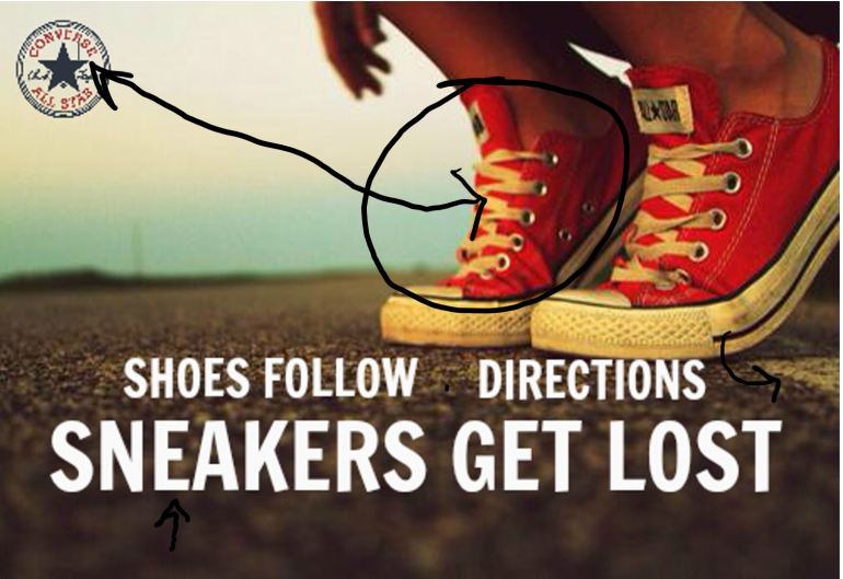
The colors in this photo give it a nice summer sunset feel to it. Like said previously, the red converse up against the blue sky makes the shoes pop because the two colors and opposite of each other on the color wheel. Having the red in the corner inside the logo also allows the viewers eyes travel between the red shoes to the corner. Having the words on the picture be in white also makes it seem crisp against what used to be the white on the shoes and also pops out from the dark pavement on the ground. The white paint located just behind the shoes also draws your eyes into the corner.
Typography
Having the font be in two different sizes causes the viewer to focus on the more important part of the saying, “Sneakers Get Lost”. The Typography is Sans Serif, which gives it more of an informal young look to it, targeting a more younger audience.
New Ad Analysis

Design
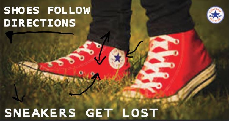
In the new design on this advertisement, there is still a lot of contrast. Comparing the dark genes with the red Converse, focused on the shoes. The blue star on the red shoe, draws the viewers eyes to the logo. The text on this ad is all aligned to the left side of the page, with the white logo on the left still draws the viewers eyes all around the corners of the ad.
Color
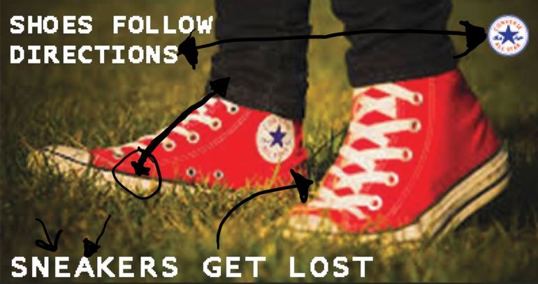 The coloring in this new ad still has a similar lighting of the original ad because it has the similar ‘sunset’ lighting. The shoes are also the same color as the original one. The white coloring of the font makes it stick out along with the white logo in the corner gives the white a ‘triangle affect’ that causes it to stick out.
Typography
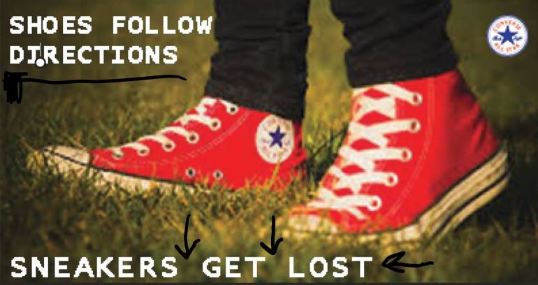 With the typography of this new ad, the same typography of sans serif was kept from the original one. The spacing on the phrase “Sneakers Get Lost” are also bigger which tells the viewers that that is the main point of the saying. (Increasing the size of this photo to fit in the article created the more pixelation of the font and logo in the corner)
Final Thoughts
Overall I think the new ad would easily work to replace the original ad. It has the same familiar feel to it, and can see the similarities between the two with the design, color, and typography.
